Design: New Restaurant Concept
As lead designers of the recently opened Margaritaville Hollywood Beach Resort, our work included the design of all the restaurants. One of the venues was a new concept within the Margaritaville portfolio – the brand’s first venture into the upscale dining segment. Our team led the project, from creating the restaurant’s concept to bringing it to life through interior design, including the art program and installation supervision. The challenge was to explore the various elements of the Margaritaville brand in a new light, demonstrating that the brand can be refined and sophisticated, while not losing its vibrancy and energy.
Our inspiration for the new concept, JWB Prime Steak and Seafood, came from the seafood canneries that were once numerous along the Florida coast. We envisioned JWB as one of the local cafés that coexisted alongside the canneries, serving fresh, exquisite seafood dishes.

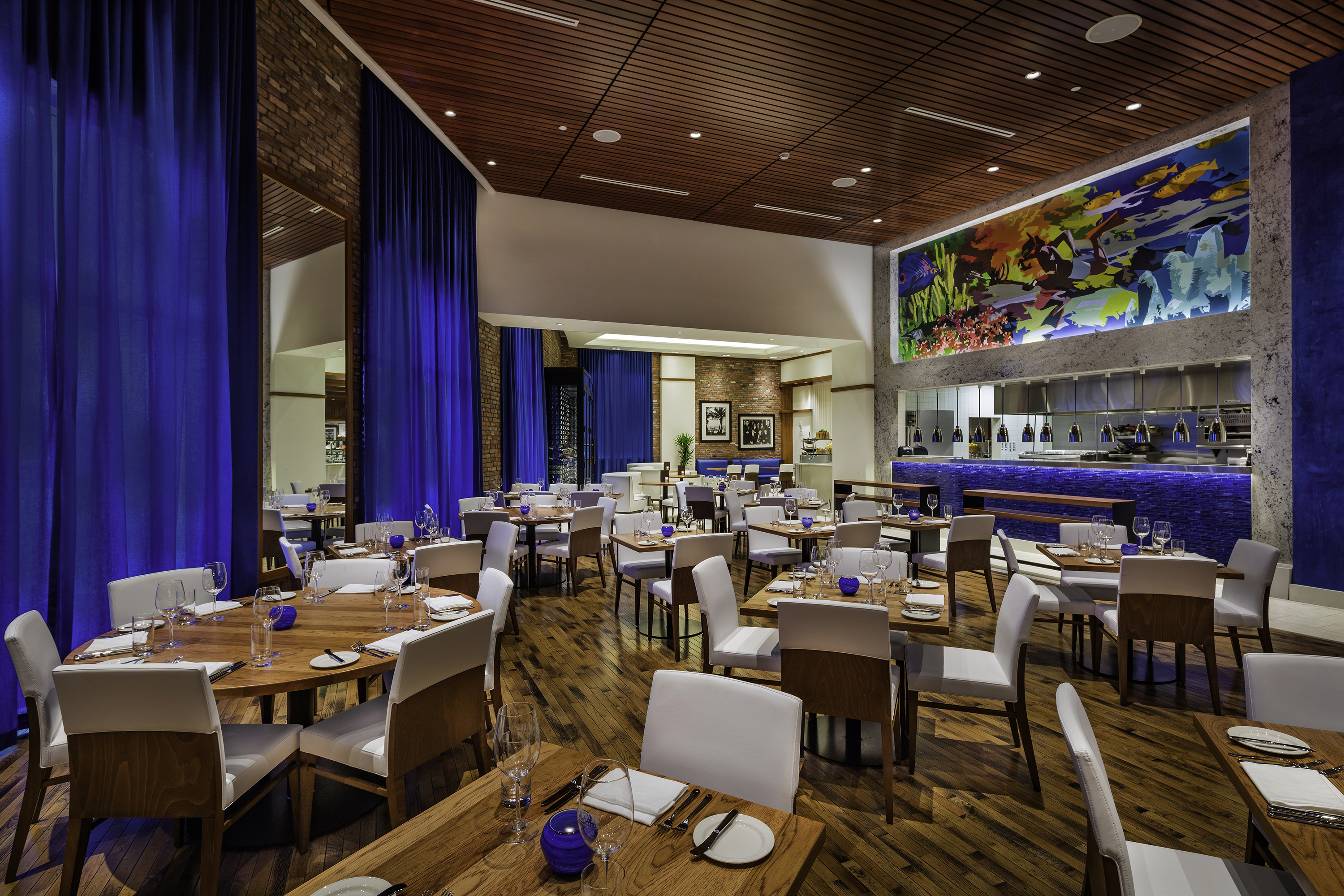
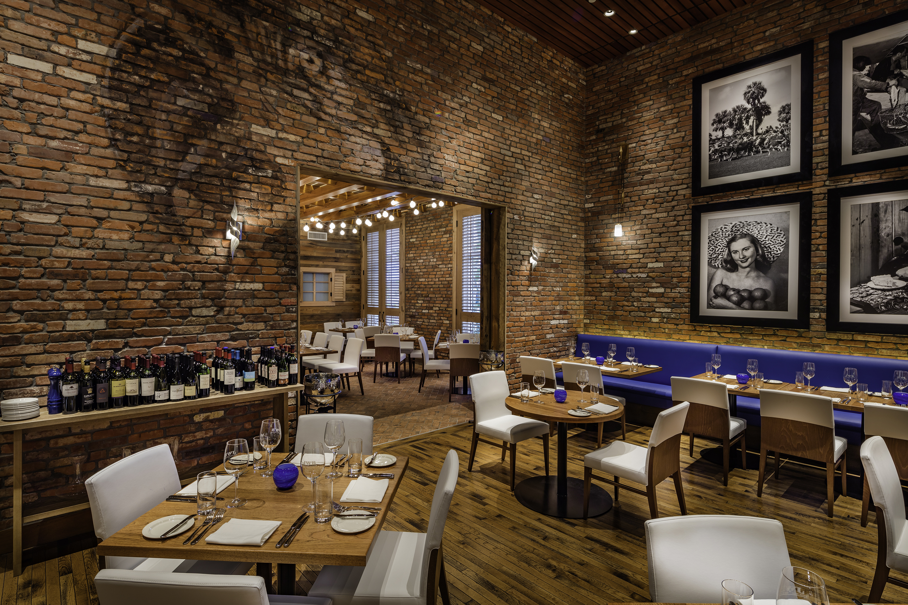
Feature walls were done in handpicked reclaimed brick with special attention given to the thickness and consistency of the mortar joints in order to convey old world craftsmanship. Aged hardwood floors along with elegant “deep ocean blue” fabric drapes were selected to soften the space. This “deep ocean blue” signature color of the restaurant is reinforced with blue Venetian plaster walls and European glass mosaic.
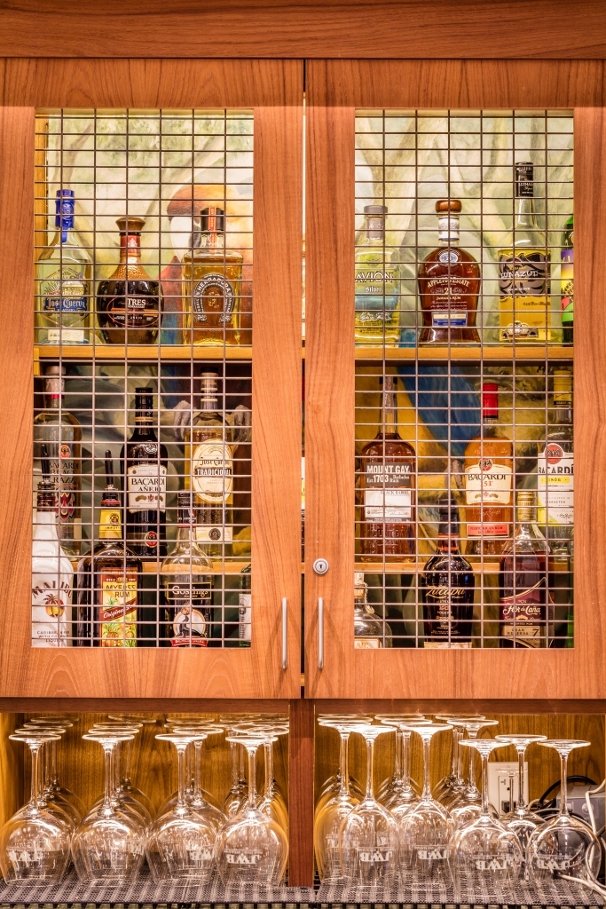
With the canneries as our conceptual foundation, we began to weave in a splash of inspiration rooted in the Margaritaville brand. (“JWB”, after all, are Jimmy Buffett’s initials.) For example, we turned parrot cages into displays for the spirits located behind the bar.

We designed original artwork and commissioned additional pieces. The focal point in the main dining room is a 30-foot long original mural inspired by the local spear fishermen – purveyors of the restaurant’s “catch of the day.”

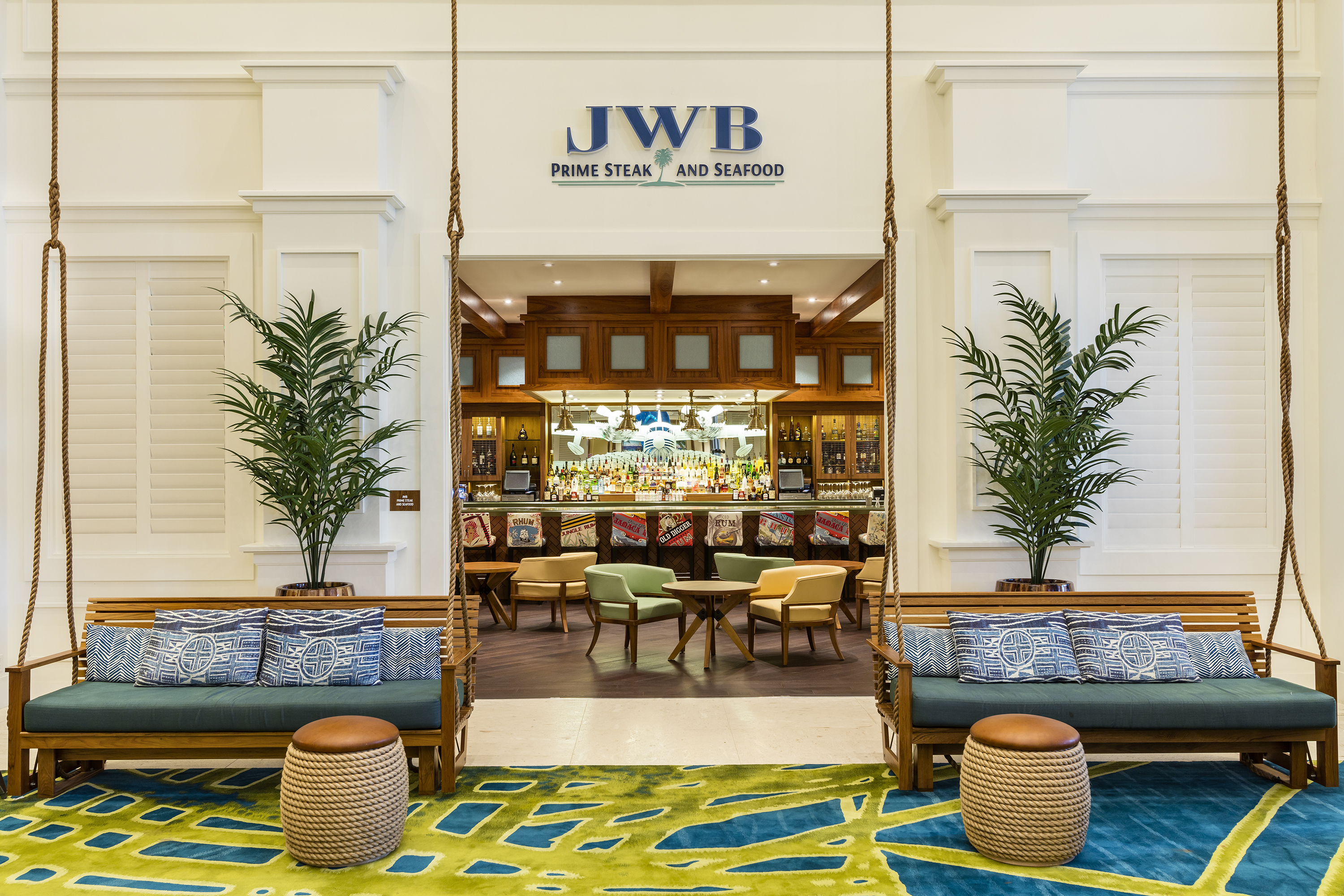
To integrate elements of fun and romance, the custom barstools feature rum labels from long gone distilleries in the Caribbean, while an aged weather worn image of a parrot provides a subtle splash of graffiti art at the entry of the private dining room.


The restaurant and associated bar operate on a late afternoon and evening schedule, so careful consideration was given to how the restaurant entrance is viewed from the lobby when it’s closed. A white shuttered wall allowed us to close off the darkened bar, and around 5 o’clock the white shutters are tilted open, so guests begin to get a peek of the restaurant coming to life before opening.

Read more about the project in Restaurant Development + Design magazine: http://rddmag.com/design/restaurant-profiles/733-l...